
There’s a moment that happens with good packaging: the customer picks it up, turns it over, and something registers before they’ve even consciously processed what they’re looking at. That moment isn’t accidental. It’s the result of deliberate decisions made about print quality, substrate choice, color consistency, and structural form. And it happens or fails to happen at the box level.
Brand identity in physical retail and e-commerce isn’t built only through logos and social media. A significant part of it lives in the packaging that travels from fulfillment center to doorstep, or sits on a shelf competing for three seconds of attention.
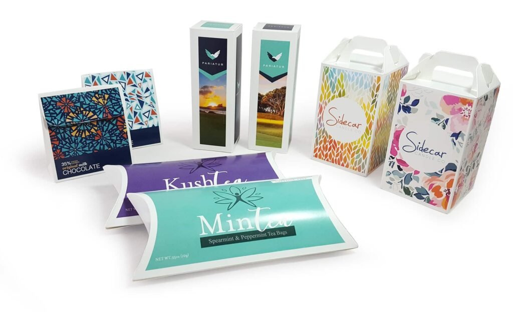
The Box Is the First Physical Conversation Your Brand Has
Before a customer interacts with your product, they interact with the packaging. That sequence matters more than most marketing teams account for. The weight of the box in hand, the resistance of the lid, the sharpness of the printed graphics all of it contributes to an impression that either reinforces the brand promise or quietly undermines it.
I’ve seen brands spend heavily on product development and digital advertising while completely neglecting packaging quality. The disconnect creates a jarring experience. Someone clicks a beautifully produced digital ad, pays a premium price, and receives the product in a box that feels generic. The product might be excellent. But that first physical moment leaves a mark that’s hard to recover from in the customer’s mind.
Printed Custom Boxes close that gap. When the physical packaging matches the quality signals the brand is sending through every other channel, the customer experience becomes coherent. Coherence builds trust, and trust is the actual currency of brand loyalty.
Print Method Selection Isn’t Just a Production Decision
One of the more consequential choices in packaging development is how the box will be printed. Flexographic printing is standard for high-volume corrugated runs; it’s efficient, cost-effective at scale, and handles spot colors well. Offset lithography, often applied through litho-lamination, produces sharper detail and more accurate color reproduction, which is why it’s common in premium retail packaging.
Digital printing has changed the landscape considerably over the past decade. Short runs, versioning, regional variations, things that were economically prohibitive before are now practical. A brand running a limited seasonal edition or testing regional markets can produce quantities that make sense without committing to a full offset run.
Where brands consistently go wrong is treating print method selection as purely a cost decision. Flexo is cheaper per unit at volume, yes. But if the brand requires tight color registration or fine type detail, flexo may not deliver what the design file is promising. The result is packaging that looks competent in isolation but doesn’t actually represent the brand at the level it was intended to. That gap between intent and execution is more common than people admit.
Color Consistency Across Runs The Problem No One Talks About Enough
Here’s something that rarely comes up in initial packaging conversations but causes real operational headaches: color consistency across production runs. A brand establishes its color identity. Pantone references are locked. First production run looks great. Six months later, a reorder comes back with a noticeable shift in the primary brand color.
This happens because of substrate variation, ink formulation changes, and press calibration differences between runs or even between facilities. For brands where color is a core identity element, think of industries like personal care, premium food, or consumer electronics this inconsistency erodes something that took real effort to build.
Specifying Pantone references is the starting point, not the finish line. Requiring press proofs, maintaining approved drawdown samples, and auditing color against standards on every run are operational practices that serious packaging programs build into their workflow. IBEX Packaging, for instance, treats color management as a technical process with documented standards rather than a visual approximation, which makes a meaningful difference at reorder.
Structural Design as a Brand Signal
Print gets most of the attention in brand identity conversations, but structure communicates too. A box that opens cleanly, holds its shape, and closes with resistance signals quality in a way that print alone can’t replicate. The tuck configuration, the score placement, the board weight all of these affect the physical experience of interacting with the package.
Brands that are building genuine identity invest in structural prototyping. They open the box fifty times and watch how it behaves. They check whether the printed panels align at the closure point, whether the corners hold after being handled, whether the insert sits flush or shifts. This kind of attention is what separates packaging that functions as a brand asset from packaging that just contains a product.
IBEX Packaging’s structural development process runs parallel to print development, which matters because the two can’t really be optimized independently. A structurally weak box with beautiful graphics is still a weak brand experience.
What Printed Custom Boxes Actually Do for Brand Recall
There’s research supporting what most experienced packaging professionals already observe intuitively: packaging that is distinctive in form and print drives higher brand recall than packaging that blends into category conventions. Distinctiveness isn’t the same as complexity. Sometimes a single well-executed color and a clean typographic treatment on quality board outperforms an elaborate multi-color design on thin stock.
IBEX Packaging works with brands across different categories, and the pattern holds that the packaging programs that deliver the strongest identity outcomes are the ones where material, structure, and print were developed together with a clear understanding of where and how the customer would encounter the box.
Common Mistakes Worth Naming Directly
Approving packaging from a screen-rendered digital proof without requesting a physical sample first is something I’d caution against strongly. Color on screen and color on board are not the same thing, and the difference can be significant enough to misrepresent the brand at point of sale.
The other mistake is designing for photography rather than for the actual customer experience. Packaging optimized for product photos often has finish combinations that look extraordinary in controlled lighting but feel awkward or fragile in a real retail or unboxing context.
Final Words
Brand identity isn’t abstract. It lives in physical objects that customers hold, open, and remember. Printed Custom Boxes are one of the most direct expressions of what a brand actually is, not what it claims to be in copy, but what it demonstrates through material choices and production quality.
The brands that treat packaging as a strategic investment rather than a fulfillment expense are the ones building something durable. And working with a manufacturing partner like IBEX Packaging, one that understands print, structure, and material as an integrated system rather than separate line items, is one of the more practical ways to make that investment pay off consistently.
References:
Hitnspin casino bonus code clients1.google.be
References:
Hitnspin casino auszahlungsdauer http://maps.google.com.ni/url?sa=t&url=https://bandori.party/user/1244890/crushrouter42/
References:
Hit’n’spin casino erfahrungen image.google.ge
References:
Hitnspin casino mobile http://cse.google.cv
References:
Hit n spin casino deutsch http://kimberly-club.ru
References:
Hitnspin casino kostenlos spielen grch37.ensembl.org
References:
Hitnspin casino erfahrungen http://clients1.google.com.gh/
References:
Hit n spin casino no deposit bonus http://kank.o.oo7.jp/
References:
Instant payid pokies australia https://play.ophirstudio.com
References:
Online pokies with payid australia real money https://www.lavoro24.link/
References:
Payid pokies https://nonstopvn.net/@federicow35926?page=about
References:
Payid online pokies australia https://sellyourcnc.com/author/malcolmqsd2/